Advisor Perspectives welcomes guest contributions. The views presented here do not necessarily represent those of Advisor Perspectives.
In a slowing economy, an increasing portion of asset returns comes from income rather than from capital gains. Consequently, investors are attracted to income-producing assets.
Performance information conveyed on return charts from many financial sources is misleading, however, because it is based solely on price return, ignoring dividends. Investors reading these charts will be unfairly biased against income-producing assets.
Financial advisors should educate their clients about total return and stay vigilant about qualifying performance charts when making investment comparisons.
Misleading performance charts
Incorrect performance information is reported daily by numerous financial tools and websites, as was documented in a recent paper. Measuring performance with price return - the return calculated simply by using the asset price at the beginning and at the end of the period – is misleading.
Suppose an advisor wants to compare VTI (an ETF tracking the total US equity market) and VBMFX (a mutual fund tracking the total US bond market) over a period of 10 years ending Oct 31, 2011. The following charts are snapshots from Yahoo Finance and Google Finance, however similar charts were observed on Marketwatch, Bloomberg and other sites.


The returns on the charts imply that VTI (+27.62%) outperformed VBMFX (+6.99%) by a wide margin. This is incorrect. These returns are price returns, measuring how much the assets appreciated in price but ignoring other sources of return, such as dividends.
What happens when we include income from dividends? The results are shown in the following table (total return numbers obtained from the website of Vanguard, the provider of VTI and VBMFX):
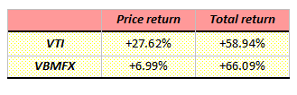
Over 10 years, the regular income from bonds compounds to a significant amount. The above performance charts are misleading in two ways:
- They underestimate the return earned by investors in either VTI or VBMFX
- They penalize VBMFX against VTI
Charting total return
Total return includes:
- Return from price appreciation of the asset (growth component)
- Return from dividends received (income component)
Calculating total return over time, it is possible to chart the assets returns from the previous example and obtain a truthful comparison. While the following chart was obtained from Kwanti, a similar chart has been observed on some websites such as StockCharts.
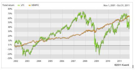
In its most common form, total return calculations assume that dividends are re-invested in the asset at no cost. This assumption is valid for most mutual funds, and equities for which a dividend-reinvestment plan (DRIP) is available, but it may not be the case for other investments. For example, the dividend may require a purchase of fractionable shares that is sometimes not allowed, or a commission may apply to the re-investment transaction. These approximations, however, are small when compared to ignoring dividends altogether.
While price return is easy to calculate (a simple division and addition), total return requires numerous intermediate calculations based on the date and amounts of dividends. This difficulty may explain why many charting websites and software do not show total returns charts.
When a total return chart is not available, an alternate representation is the growth of $10,000 chart commonly found on prospectus and websites of mutual funds providers, as required by the SEC, where $10,000 represents a hypothetical investment in the asset and the dividends are assumed re-invested. Growth of $10,000 charts may also be found on Morningstar. These charts are appropriate for performance comparisons.
Benchmarking with total-return indexes
The discussion extends beyond stocks, funds and ETFs. For market indices, using price returns instead of total returns causes further distortion when these indices are used as benchmarks.
As an example, let us consider the S&P 500 Index. Many companies in the S&P 500 Index pay dividends that aggregate to a few percent of return per year for the index. But this income is not taken into account in the S&P 500 Index published values. Because of this ignored return, comparisons using this index as a benchmark are suspect and most likely misleading.
Fortunately, the S&P 500 Index is published in both versions:
- S&P 500 Index
- S&P 500 Index Total Return
The latter properly incorporates dividends and should be preferred in benchmarks. The following chart shows how the total-return version of the index has an excess cumulative return of almost 9% when compared to the standard index, for the three years ending Oct 31, 2011.

Suppose an advisor wants to compare an asset with a total return of 32% to that of the S&P 500 for this same period. If he uses the standard version of the S&P 500 Index, he will mistakenly conclude that the asset return is higher than the benchmark.
Whenever possible, advisors and investors should use total-return indices. While there is no convention to designate total return indices and differentiate them from standard indices, index providers often use the suffix “TR” or “Total Return.”
Summary
Advisors must stay vigilant in qualifying the return they seek and educate their clients on the nature of asset returns. Charts from common financial sources do not represent the true return earned by the investor and penalize dividend-paying assets in comparisons with other assets.
Advisors are advised to seek and use total return charts that include price appreciation and income from the asset. For benchmarking, it is preferable to use total-return indices.
Christophe Gauthron is the CEO of Kwanti, a software provider to financial advisors and institutions.